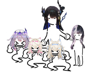
Alright, I'm gonna put my character design autism here since it's more of a general thing and the HoloEN3 thread is currently livetweeting the
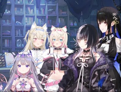
ongoing collab, but seeing all the new girls together like this is raising some flags for me.
View attachment 38674
There's a big difference in the design philosophy compared to Myth and Council's respective group lineups, with the most obvious thing being the use of colour. The colours themselves are much less saturated, and the palette range across the five designs is much smaller and used more conservatively against white and black elements. This works really well for group shots as it makes them look like a more cohesive unit, but aside from the twins I worry it'll take longer for their designs to leave an impression individually.
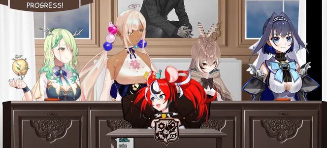
Compare them to the other group shots to see what I mean:
View attachment 38677
View attachment 38678
These look less cohesive when put together, but with the exception of maybe Sana they each individually have a single, distinct colour you associate them with, which leaves more of a conscious
and subconscious impression. "Blue shark", "blonde detective", "REEEE PINK WOMAN" etc. are more immediately striking than subtle purples against black or white.
Will this be a problem long-term for the new girls? Probably not, they have time for their personalities to pull more of the weight, but it makes me wonder if this was an intentional change in direction for one reason or another, or if it's just a product of all the more saturated tones being "taken" by now.


